1. Start by going to 'file' and 'open' and go find a picture for your page. Since this is just a lesson, don't worry about the photo, you just need one to play with.
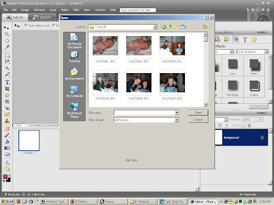
2. Now that you have a photo open, you will see it in your photo bin (the big box on the very bottom of the program). OK, now go to wherever you saved your digital kits and pick out which one you would like to use on your layout. I usually open either the entire kit (just so I have lots of options) or I may already know what I want for the layout so I just open those elements. For this lesson, try to select a background paper and a few '3D' type embellishments (ribbon, word art, brads, etc.).
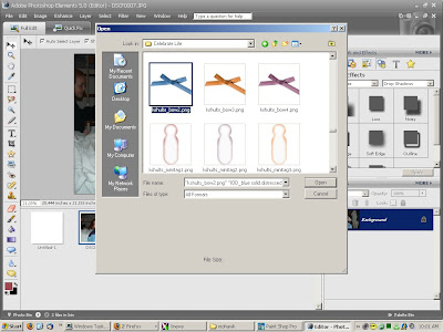
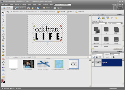 3. With me so far? Easy, right?! OK, so you have a workspace, a picture, and elements. The first thing you want to do is make sure your 'move' tool is activated (the 4-way arrow at the very top of your tool bar). This tool will allow your to move elements once they are on your page. Now, click on your background paper down in the photo bin and drag it up onto your workspace. It'll take a few second for it to appear.
You will notice in your layer palette (the box in the bottom right of your screen) that you now have 2 layers...your background and the paper. The layer palette is an AWESOME tool. It shows you the order of the elements on your page. Think of your page as a stack of transparencies with the elements printed on them...you can arrange the pages to move things forward and backward in perspective.
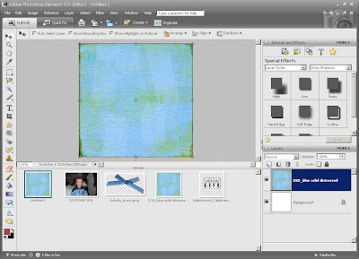
4. So, now you can drag your photo up onto the page. When you do so, you may want to resize it. To do so, you will notice when you click on the photo, it will have a dotted box around it with squares at the corners and the sides. You can click and drag these boxes to resize the photo. Use the corner boxes to make it bigger or smaller as they will keep the aspect ratio of the photo true.
If you look at the Layers Palette again, you will notice the photo layer is blue. That means it is the layer you are working on. Anytime you want to know what layer is selected, take a peek down there.
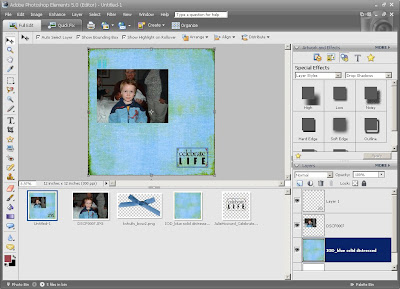
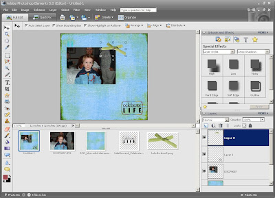
5. So, our page needs some Oomph! Click on one of the embellishments you opened . Use the 'marquee' tool ( the dotted square on the tool bar). Highlight the entire element and then hit 'control 'c'' to 'cut' out the element. Now, you can go back and click on your page in the photo bin and hit 'control 'v'' to paste the element on your page. Now, it may not show up as the top layer on your page. All you need to do is look in your layers palette and see if it is on the top. If not, just click and drag it there. You can also make sure the embellishment is highlighted in the layers palette, click your 'move' tool on the tool bar, and then look on the top of the screen you will see 'arrange'. This tool will allow you to move the elements . You can click 'move to front' to have the element be the first on the page.
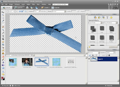
6. Once you have the embellishments on your page, you can use the 'move' tool to click on them and arrange them on the page as you like. When you click on them, you will see a blue box around the element. This means the element is selected and is ready to be moved. Just click and hold the mouse and drag the element wherever on the page you want it.
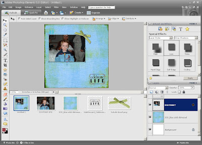
7. The last really basic step for a layout is adding drop shadows. These are the shadows a paper scrapbook page has that the elements make because of their dimension. Digital scrappers recreate these shadows with drop shadows.
In your 'layer palette' (top right of the screen) you can click on 'layer styles' and then 'drop shadows'. Then, all you have to do is select an element to add a shadow to (either by clicking on it in the layer palette or by clicking on it on the page itself) and select the 'low' shadow and then click 'apply'. You will see a slight shadow on your element! So cool! Also, in the layer palette, you will notice a little sun icon on the layer.
8. Well, there you go! A super duper basic page to get you started. I really find trial and error are the best ways to learn. I have learned so much just by clicking on stuff! And remember, you can undo anything in the digital world, so don't worry about making mistakes! It is awesome! LOL!
Saving your pages is super easy, too. Just hit 'file' 'save as' and save it to a folder somewhere on your computer. I save my pages as jpegs just so they don't take up so much space and I can upload then to the net.
If you have ANY questions, please comment to this post and I will answer them there. Good Luck! I am going to see if I can get a member gallery somehow so I can upload your pages to my blog! I think that would be awesome!





3 comments:
I did it!!! Thank you Sarah for the awesome tutorial. This is exactly what I was looking for and needed to get me started. THANK YOU for being an awesome teacher. Here is a link to my blog where I posted my first digi-page. Very basic but I will learn how to spice it up more as I go along and play. But you really have helped me get started. You are the best!
http://360.yahoo.com/denisebryant1989
You did AWESOME!!!!!! That page is adorable! I'm so proud of you!
Your tutorial was VERY helpful!!! I can't figure out the drop shadows but I'm working on it. I have a different version of PSE so I think that may be the problem. But, thanks for sharing your tutorial!! It really helped!
Post a Comment